
Gesture Drawing and Fast Work / Developing a Style
Gesture Drawing and Fast Work / Developing a Style
In this blog post I want to show you about developing a style, and how I advanced my drawing/sketching technique – primarily by doing more gesture drawing.
Going to Art College
In 2002-2003 I went to study at Edinburgh College of Art. Here I learned a lot about drawing technique, sketching, design, and also about the whole suite of art disciplines as well (architecture, sculpture, fine art, painting & drawing, tapestry, fashion design, etc.) These were crazy years. Crazy fun though.
Drawing in the field
Because a lot of our coursework had to be done outdoors, I quickly had to learn new techniques and styles, and it was here that I was exposed to a wide variety of artistic styles: from fashion illustration to architectural rendering; from life drawing to landscape construction diagrams; from masterplans meticulous in their detail to very, very abstract art. I found it fascinating that so many different ways of expressing and conveying visual information existed under one roof!
Like any art college, we were encouraged to wander between departments and learn about other disciplines, which I frequently did. I shared a flat with an illustration student who did awesome children’s book concepts and a fashion student who was perpetually ironing her creations – it was brilliant!
My art tutor was brutal and to the point in her summary of my technique starting out:
“You’ve got a good grasp of drawing but you’re awfully tight – you need to ‘loosen up’ a bit!”
And so it began.
Look, when you’re outside in the freezing cold all day making notes about visual style and things of interest you can’t be fussing over the detail and looking for photographic accuracy. Gestural drawings – quick and rapid sketches done everywhere noting key and important points – are the way forward.
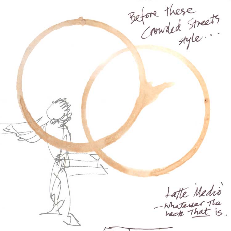
Amshterdaam:
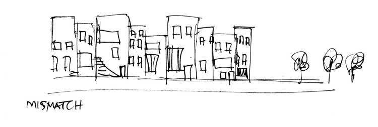
Outlines. Relative heights. Placement. Spacement. Key features. No more.
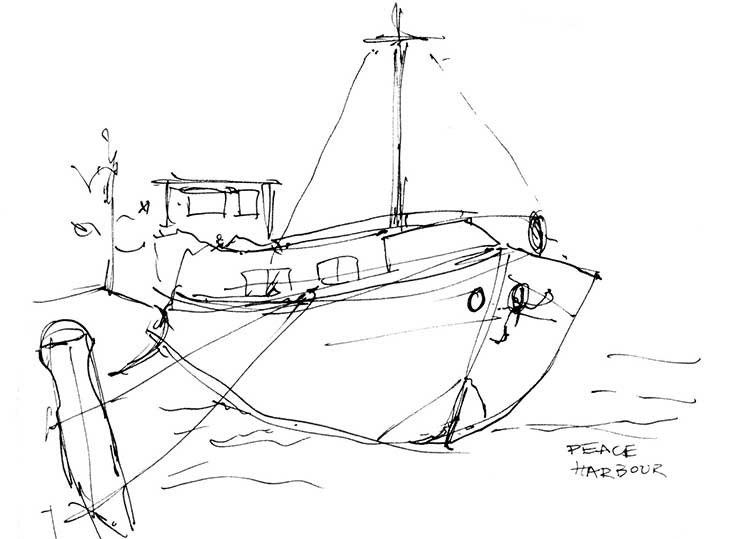
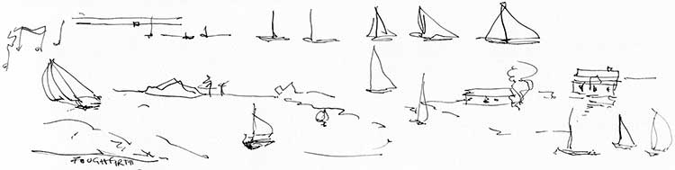
Boats in similar:
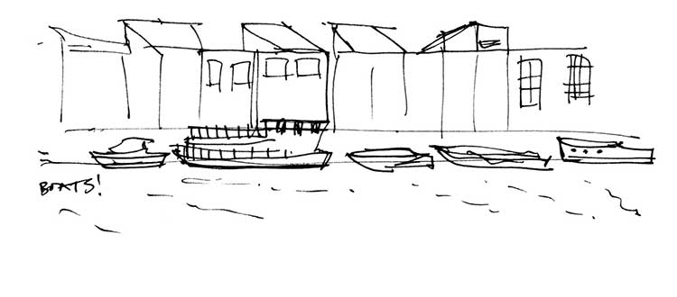
…and more boats:
We talked a lot in our tutorials about using pen and being committing to making fewer, yet bolder marks. Having simplicity of line and information rendered on a white background was key. One little tip that I think has always stuck with me is that sometimes you can do what you think is an awful doodle or scribble on a tiny piece of paper, but blown up against a white background it can look quite effective. Think of the brevity (and confidence) of Picasso’s Dove:
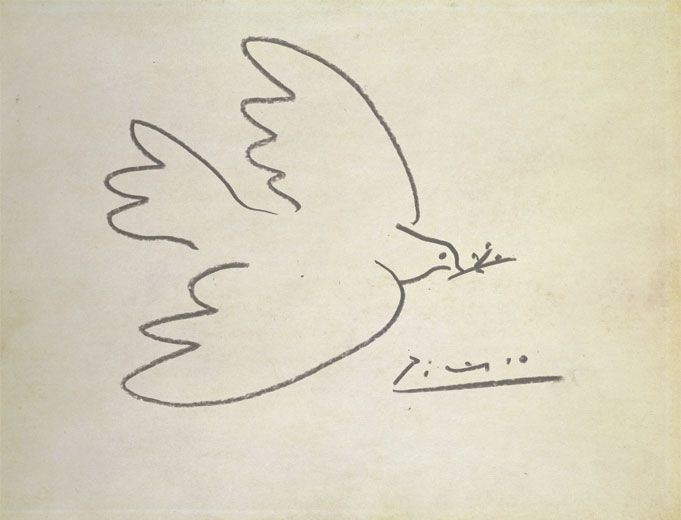
To me this then becomes about being almost like an extension of your own signature. (Actually, look at that signature in the above image!) Confident. Flowing. Quick. Hasty (or it could be Deliberate?). Natural. You shouldn’t have to ‘overthink’ it – or it isn’t your own.
Using pen to capture form, mood and movement:
Sinuous bridge in Amsterdam:
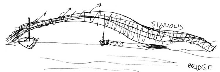
We’re not looking for engineering accuracy here, we are looking for how a thing wants to behave. How it moves.
Sketching people in the canteen:
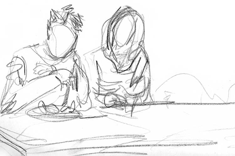
Doodle from my sketchbook, café/people-watching…
Putting personality into your drawing
What I like about this looser style of sketching is that you can start to see personality coming into the drawing. MY personality. I can see the humorous bits of something that caught my eye. I can see vigour and excitement. Energy. Exclamation marks! Almost a bit cartoony.
I have seen some very good illustrators who do work in the most precise, thorough detail, and that is just fine – for them. They are very calm, unexcitable people who are blessed with infinite patience. Not me! I work in a hurry, I draw in a hurry, and if something becomes too laboured or ‘finished’, then it no longer looks very good – in my critical opinion now.
Gesture drawing of my hand:
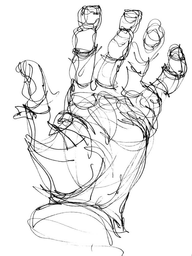
[I think if this had to have a caption, it would be: ‘URGH! Why are my hands so HUGE?’]
Drawing the important bits of information only
In some forms of illustration, you want to be mainly conveying only the important bits of information; not all of it. If you wanted a snapshot of something for later reference, you would just take a photo. But a snapshot photo doesn’t see anything in particular: it sees everything all at once uniformly. Here, once and for all, I got my head round the importance of drawing as a unique and valid means of recording things in its own right, as distinct from photography. Both can have their place.
Plant detail drawings:
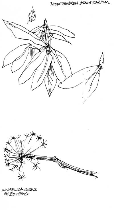
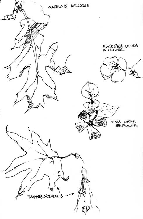
It’s all about figuring out which parts of the plant that are the most important, seeing differences, seeing the notable features.
Here’s an exercise I did at Art College using pen and watercolour wash: I tried to make it look windy. (Well it is Edinburrrrghh!)
Planting/groundcover analysis:
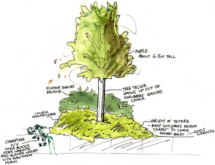
It was a weird lesson I learned about my drawing style – the more childlike it became, the better it was liked, apparently.
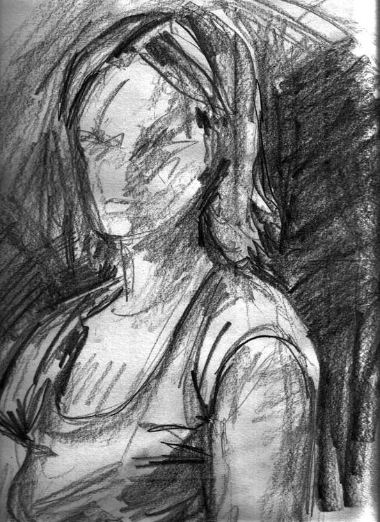
Gestural self-portrait – making quick and bolder marks:
Studying Shapes and Silhouettes
I did this next set of doodles fairly recently, just playing about and experimenting with a pen and a couple of simple shapes. Just to see how simplified I could actually make an object and make it still recognisable. It seemed the shape of a musical note wasn’t all that dissimilar to the overall silhouette of a boat from afar!
From notes to boats…
This is about where I am at just now. My creative aims now are to keep pushing myself, to keep refining and developing my own style so that I draw things that ‘come from the heart’; i.e. they look very easy and natural. I doodle quite a lot – draw things from memory. I have become more confident in just drawing a shape from memory the way I want to draw it rather than having to study it in detail so that it looks more ‘right’. I am interested in the look of a single pen or pencil line or paintbrush wash just for its own sake. If it looks wonky then so what.
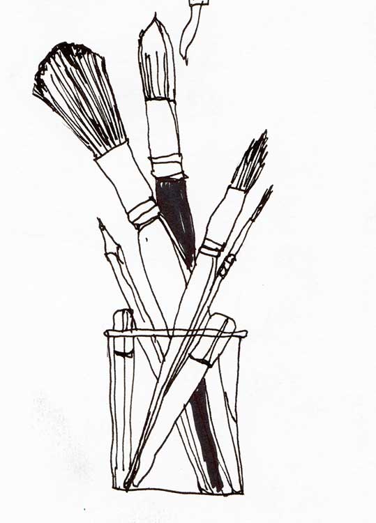
My own preferred media are pen and ink, and watercolour washes. I also use pencils of varying degrees of softness and Conte pencils.
Final Thoughts on Being Unique
It goes without saying that in order to be noticed, creatively or indeed any other way, you have to come up with something that is truly different. You have to be unique. You’re going to have to take all you have learned about something, but apply that ‘extra something’ that you know about, that extra insight (that no-one else has), to your creative output!
Developing your own unique style in any artistic field probably has to take time and practice. And quite a bit of confidence to let go and trust your own instincts too. It won’t come overnight, but as with anything really, the more drawing and observing and mark-making on paper you do, the more you will see just how much can be omitted and how much needs to be committed.
I hope this article has been useful!
Take care,
Annie x
If you liked this, you should follow me on Twitter and Instagram.